Bowzer: A Display Font That Makes Your Headlines Instantly Friendly
It’s 9:47 a.m., and I’m squinting at a YouTube thumbnail on my phone—testing how it holds up in the feed. The background is bright, the image tight, but the headline feels… quiet. Too polite. Too safe. That’s when I swap in Bowzer. Suddenly, the text pops—not with volume, but with warmth. It’s like swapping a formal handshake for a high-five from your favorite camp counselor. That’s Bowzer in action: a display font built to spark recognition before the viewer even reads the words.
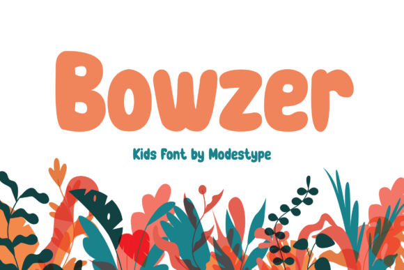
Bowzer isn’t trying to be subtle. Its rounded terminals, generous x-height, and gentle bounce give it a playful yet confident rhythm—like chalk art drawn with intention, not haste. There’s no forced quirkiness or cartoonish exaggeration. Instead, it balances friendliness with clarity, making it ideal for moments where you need people to *feel* invited, not just informed. Think birthday invites, school fair banners, kids’ app onboarding screens, or a “New Course Launch!” graphic aimed at educators who scroll fast and trust authenticity over polish.
In our recent Pinterest campaign for a summer learning toolkit, we used Bowzer for all pin titles—paired with a clean, neutral sans serif (Inter, set at 16px) for body copy. Why? Because Pinterest thumbnails are tiny, vertical, and scrolled in silence. Bowzer’s strong letterforms held up at 28px even on older Android devices, and its open counters kept “READ ALONG” legible against soft watercolor backgrounds. No kerning tweaks needed. No pixel-wrangling. Just paste, adjust spacing, and go.
That reliability extends across platforms. On Instagram Reels covers, Bowzer shines as a short, centered callout—“FREE PRINTABLE!” or “STARTS TOMORROW”—especially over blurred photo backgrounds. Its weight distribution prevents visual sinking, and because it’s designed as a display font (not a text face), it doesn’t compete with captions or voiceover timing. In email banners? Same story. We tested two versions of a webinar promo: one with a standard bold sans, one with Bowzer. The Bowzer version didn’t lift open rates—but team members consistently flagged it as “the one that made me pause.” That micro-moment of attention? That’s where display fonts earn their keep.
Here’s what works—and what doesn’t—with Bowzer:
- Best for: Short headlines, logo-style text blocks, campaign labels (“SUMMER SQUAD”), quote graphics, product teaser banners, and branded templates where tone matters as much as message.
- Avoid for: Paragraphs, pricing tables, legal disclaimers, or anything requiring dense, sustained reading—even at large sizes. It’s a display font, not a workhorse text face.
- Mobile tip: Use Bowzer at 32px minimum for iOS lock screen banners and 28px for Android push notifications. Always test on actual devices—not just preview panes—because rendering engines handle rounded glyphs differently.
Pairing Bowzer is intuitive, not intimidating. We default to pairing it with a warm, humanist sans serif (like Poppins or Lato) for contrast without conflict. The sans grounds the energy; Bowzer lifts the mood. For more editorial moments—say, a blog series about creative teaching—we’ve layered it over a soft serif (Cormorant Garamond Light) for headers, letting Bowzer act as a friendly anchor above more nuanced body text. Never pair it with another playful display font—that’s visual noise, not harmony.
Before locking it into any campaign asset, we always check three things: First, the included styles. Bowzer ships with a full set of uppercase, lowercase, numerals, and punctuation—but no italics or bold variants. That’s fine, because its personality lives in its shape, not weight shifts. Second, file formats: we confirm .woff2 is available for web use and .otf for design apps. Third—and this is non-negotiable—we verify commercial licensing covers digital ads, client deliverables, and downloadable templates. One misstep here can derail a whole campaign rollout.
We also test readability across backgrounds. Bowzer loves light backgrounds—its soft edges glow against white or pale pastels. On dark mode or deep navy overlays? We add a crisp 1px white stroke (not shadow) to maintain contrast without blurring the charm. And yes—we still run quick WCAG contrast checks. Playful doesn’t mean inaccessible.
In a recent online shop campaign for handmade classroom supplies, Bowzer became our unofficial “joy signal.” We used it only for category headers (“Storytime Corner,” “Rainbow Crafts,” “Quiet Time Kit”)—never product names or prices. That restraint made those headers feel like invitations rather than labels. Teachers told us they remembered the section names first. That’s Bowzer doing its job: reinforcing emotional context so the message lands faster, sticks longer, and feels more human.
It’s not magic. It’s smart typography choice—made early, used intentionally, and respected for its limits. Bowzer won’t fix weak copy or poor layout. But when your goal is to make a headline feel welcoming, memorable, and unmistakably *for kids—or the people who love them*—it removes friction between idea and impact. You don’t have to explain the tone. Bowzer communicates it in the first glance.
So next time you’re building a set of Instagram posts for a back-to-school launch, prepping YouTube thumbnails for a new educational series, or designing email banners for a community workshop—ask yourself: does this headline need to be seen, or *felt*? If the answer leans toward felt, Bowzer isn’t just an option. It’s the quickest, most reliable way to say, “We’re glad you’re here.”