Chalky: A Display Font That Adds Warmth and Clarity to Digital Interfaces
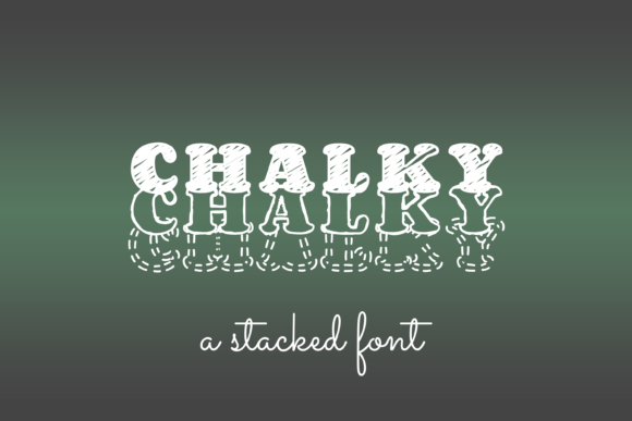
As a UI designer who ships landing pages, SaaS dashboards, and brand-forward e-commerce experiences, I treat fonts like functional design assets—not just decorative elements. Chalky stands out because it delivers expressive personality without sacrificing digital legibility or layout control. It’s a display font with intention: soft-edged, hand-drawn texture, subtle irregularity, and generous x-height—designed to be seen, not just admired.
Visually, Chalky balances approachability and polish. Its chalk-like strokes suggest craft and authenticity, but the letterforms are carefully engineered for screen use: open counters, consistent stroke contrast, and generous spacing between characters. Unlike many handwritten or script fonts, Chalky avoids excessive flourishes or ligature-heavy complexity—making it far more reliable in responsive contexts where scaling and rendering consistency matter.
In practice, I reach for Chalky when I need to reinforce tone without overcomplicating hierarchy. It works exceptionally well in hero sections—especially on creative portfolios, coaching sites, or boutique online stores—where the first impression must signal warmth, expertise, and human-centered values. A headline like “Your First Design Sprint Starts Here” set in Chalky at 48px on a light background reads clearly on desktop and scales cleanly down to 36px on mobile, thanks to its strong internal rhythm and balanced proportions.
For conversion-focused layouts, Chalky shines in short, high-impact areas: CTA buttons (“Get Started”, “Book a Call”), section dividers (“What You’ll Learn”, “How It Works”), and testimonial highlights. Because it’s optimized as a display font—not body text—I never use it below 24px, and I avoid long paragraphs or dense content blocks. Instead, I pair it deliberately: Chalky for headlines and accents, paired with a neutral sans serif (like Inter, Poppins, or Manrope) for all body copy, form labels, navigation, and interface text. This pairing creates clear visual hierarchy while maintaining accessibility and fast scanning behavior.
On dark backgrounds—common in modern product landing pages or app marketing sites—Chalky performs well with slight letter-spacing adjustment (+0.5–1px) and a subtle text-shadow (1px 1px 2px rgba(0,0,0,0.1)) to preserve edge definition. Over image overlays, I use a semi-transparent background bar behind the text or apply a soft drop shadow to ensure contrast meets WCAG AA standards. On mobile, I test Chalky at 28–32px for H2s and confirm that touch targets remain comfortable—even with its textured edges, it doesn’t blur or pixelate on high-DPI screens.
Chalky also supports consistent brand identity across digital touchpoints. When used in a digital brand kit, it anchors the visual language across website headers, email banners, social media graphics, and even in-app onboarding modals. For example, a wellness course platform uses Chalky for course titles (“Mindful UX Foundations”) and module headers, then switches to a clean, variable sans serif for lesson descriptions and instructor bios. The result is a cohesive yet dynamic voice—one that feels personal but remains professional.
It’s worth noting what Chalky isn’t designed to do: it’s not a replacement for system fonts in navigation menus or data tables. Nor is it ideal for legal disclaimers, pricing tables, or multi-line product descriptions. Its strength lies in short, intentional bursts of voice. Think logo lockups (when used as wordmark text), blog post titles, feature cards, and branded newsletter headers—not paragraph text or inline links.
Font pairing matters—and Chalky pairs best with typefaces that offer structural contrast. A geometric sans serif (like Montserrat or IBM Plex Sans) gives crisp counterbalance; a warm, low-contrast serif (like Literata or PT Serif) adds editorial depth for storytelling sites or knowledge-based brands. Avoid pairing it with other decorative or script fonts—that dilutes clarity and weakens hierarchy. And always test line height: with Chalky headings, I typically use 1.1–1.25 for H1s and 1.3–1.4 for H2s to preserve breathing room without crowding.
From a technical standpoint, Chalky includes web-optimized WOFF2 files, multiple weights (Light, Regular, Bold), and extended Latin character support—including accented characters for French, Spanish, German, and Portuguese. It does not include Cyrillic or Arabic glyphs, so international SaaS products serving those markets will need supplemental type solutions. For most English-first digital products, however, the included styles cover common use cases—from minimalist portfolio sites to vibrant Shopify banners.
Licensing is practical and transparent: Chalky is a commercial font, meaning it requires a license for any public-facing digital use—including websites, client projects, online stores, landing page templates, and branded digital assets. One license covers unlimited domains and projects under a single business or individual creator. No monthly subscriptions, no usage caps—just one-time purchase with perpetual rights. That predictability makes it easy to budget into design systems and brand kits without hidden renewals.
I’ve used Chalky across a range of real projects: a ceramicist’s online shop (hero banner + product category headers), a UX research consultancy’s case study pages (section titles + quote pullouts), and a mindfulness app’s onboarding flow (step headers + motivational microcopy). In each case, Chalky elevated tone without compromising usability—and users consistently describe the experience as “inviting,” “thoughtful,” and “human.” That’s rare for a display font.
Ultimately, Chalky earns its place in my font stack because it solves a real design problem: how to communicate warmth and creativity while maintaining digital rigor. It doesn’t shout. It doesn’t distract. It simply makes your message feel more intentional—and that’s exactly what modern web design demands.