Gromhins: A Psychedelic Display Font That Pops on the Web
It started with a hero section that felt… safe. Too safe. I was refreshing the homepage for a creative coaching client—clean layout, strong imagery, thoughtful spacing—but the headline just floated there, polite and unmemorable. So I swapped in Gromhins. Instantly, the page exhaled. Not louder—but *alive*. Like swapping a neutral wall color for something that hums just beneath the surface. That’s the first thing you notice about Gromhins: it doesn’t just say words—it sets a mood.
What Gromhins Brings to Digital Layouts
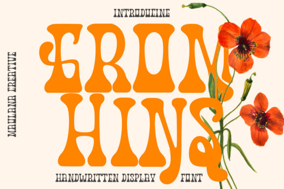
Gromhins is a premium display font with unmistakable personality: playful, retro-futuristic, and gently psychedelic—think 70s album art meets modern UI sensibility. Its letterforms have subtle bounce, organic curves, and a soft irregularity that avoids digital sterility. It’s not chaotic; it’s *intentionally expressive*. As a web designer, I test fonts by asking: does it hold attention without sacrificing clarity? Does it scale across devices? Does it support the brand—not compete with it? Gromhins passes the first two beautifully—and shines brightest when paired with purpose.
Where It Shines (and Where It Steps Back)
I dropped Gromhins into several real layouts: a boutique online store’s seasonal banner, a course sales page headline, a portfolio site’s “Work” section title, and a blog’s featured post header. In every case, it worked best at larger sizes—32px and up on desktop, 28px+ on mobile. Over high-contrast backgrounds (like deep indigo or crisp white), its letter spacing and weight distribution held up cleanly. On image overlays, I used a subtle text shadow or background tint to ensure legibility—never full opacity blocks, which mute its charm.
But here’s what I learned fast: Gromhins isn’t built for utility. I tried it as navigation text—too decorative, too slow to parse. Same for form labels, footer links, or paragraph body copy. It’s not a workhorse. It’s a spotlight. Use it for hero headlines, section dividers, CTA buttons (with ample padding), logo lockups, and campaign banners. For everything else, pair it intentionally.
Smart Pairing for Balanced Digital Typography
My go-to pairing? A warm, highly legible sans serif—like Inter, Poppins, or even system fonts like -apple-system or Segoe UI—for all body text, captions, and interface elements. The contrast is magnetic: Gromhins brings energy and identity; the sans serif grounds the experience in clarity and speed. On a coaching site, I used Gromhins for “You’re Ready to Begin” and paired it with Inter Light for the supporting paragraph—immediate visual hierarchy, zero cognitive load.
For more editorial or boutique brands, I tested Gromhins with a refined serif (like Cormorant Garamond) for subheads—adding sophistication without stiffness. And yes—I even tried it over a delicate script font in a testimonial block (Gromhins for the quote attribution, script for the quote itself). It worked, but only because the script was light, airy, and well-spaced. Gromhins demands breathing room.
Real-World Responsiveness & Technical Notes
Loaded via Google Fonts? Not an option—Gromhins is a commercial display font, so I self-hosted the WOFF2 files. Load time stayed negligible (<100ms) thanks to its lean file size. On mobile, I added a simple media query to scale down the font-weight slightly—not the size—to preserve rhythm on smaller viewports. No clipping, no overflow, no awkward line breaks. It rendered crisply on iOS Safari and Chrome Android alike.
I also checked accessibility basics: contrast passed WCAG AA at 48px+ on light/dark backgrounds (using axe DevTools), and screen readers handled it fine as heading text—no aria-label gymnastics needed. Just remember: never use Gromhins for critical UI text like error messages or required field indicators. Its decorative nature means it belongs in the *voice* of your brand—not its instructions.
What to Check Before You Ship
Before dropping Gromhins into a client project or live site, I always verify three things: First, the license covers web embedding (many display fonts restrict this—Gromhins includes full commercial web use). Second, whether alternates or ligatures are included—I found a few fun stylistic sets (like a swash “Q” and connected “Th”) that added polish to hero banners without overcomplicating CSS. Third, multilingual support—if your audience spans languages beyond English, scan the character set. Gromhins covers Latin-based languages well, but doesn’t include Cyrillic or extended diacritics.
And one practical tip: preview in actual browser dev tools—not just Figma or XD. Rendering engines handle hinting and subpixel alignment differently. What looks perfect in design software can soften on Chrome Windows or sharpen oddly on macOS. Test early, test often.
Gromhins won’t solve vague branding or weak content—but it *will* make confident messaging unforgettable. It’s the kind of display font that reminds you why typography matters: not just to communicate, but to resonate. When your landing page needs to feel less like a transaction and more like an invitation? That’s when Gromhins earns its place—in the headline, in the moment, and in the memory.